


How To Use Canva To Create Charts And Graphs Tutorial For Beginners
Canva Tutorial
Watch The How To Use Canva To Create Charts And Graphs Tutorial For Beginners Video Below

How To Use Canva To Create Charts And Graphs
Learn How To Use Canva To Create Charts And Graphs
Easy To Follow Canva video Tutorial For Beginners
Here Are Some Of Our Services
PLR Canva Templates!
Start Creating Stunning Designs with Customizable Templates!
Get Instant Access to These Ready-to-Use PLR Canva Templates Today!

Content Creation Services


Unlock Canva Cash: The Ultimate Guide to Making Money with Canva Templates!
Please Watch The
Video Below
Plus Get 4 Free Canva Mockup Templates & Start Earning Now!
Frequently Asked Questions
Welcome to Our Comprehensive FAQ Guide on Creating Charts and Graphs with Canva
Navigating the world of data visualization can be both exciting and challenging, especially for beginners. Our detailed FAQ section is specifically designed to guide you through the process of creating charts and graphs using Canva, a versatile and user-friendly graphic design tool. Whether you’re a student, a professional, or someone who loves to organize and present data in a visually appealing way, these FAQs are tailored to make the journey easy and enjoyable.
In this guide, you’ll find a wealth of information on how to effectively use Canva’s wide array of chart and graph tools. From selecting the right type of chart for your data to customizing it to suit your specific needs, each FAQ provides step-by-step instructions, practical tips, and real-life examples to help you become proficient in visualizing data.
Our goal is to help you transform complex data into clear, engaging, and informative visuals. With Canva’s intuitive design platform, you’ll learn how to create professional-looking charts and graphs that can enhance presentations, reports, infographics, and more. We cover everything from basic bar and pie charts to more complex line and comparative charts, ensuring you have the knowledge to handle various data visualization needs.
So, whether you’re aiming to present data in a business meeting, showcase research findings, or simply organize personal information, these FAQs are here to assist you in mastering the art of chart and graph creation with Canva. Let’s dive into the world of data visualization and bring your data to life!
Answer: Creating charts and graphs in Canva is a straightforward way to visualize data in an engaging and clear manner. For beginners, Canva’s intuitive interface and array of tools make it accessible to create professional-looking charts without needing advanced design skills.
Setting Up Your Canva Project: Begin by logging into your Canva account. Select ‘Create a design’ and choose the type of document you need, like a presentation, report, or infographic. Within your chosen design type, you can incorporate charts and graphs.
Finding and Adding a Chart: In the Canva editor, click on the ‘Elements’ tab and scroll down to ‘Charts’. Here, you’ll find various types of charts including bar, line, pie, and more. Select the chart that best fits the type of data you want to represent.
Customizing Your Chart: After adding the chart to your design, click on it to customize. You can enter your data, adjust the colors, change the font size and type, and modify the labels to suit your needs.
Real-Life Example: If you’re creating a presentation on annual sales, choose a bar chart to represent sales data. Input your data to reflect sales figures across different months or products, and customize the bar colors to match your company’s color scheme.
Answer: Customizing the design of charts and graphs in Canva allows you to tailor them to fit the style of your document and make your data stand out.
Editing Chart Data: Double-click on the chart to input your own data. You can manually enter data points or even upload data from a spreadsheet. Make sure the data is accurate and reflects what you intend to convey.
Adjusting Chart Style: Canva lets you adjust various style elements of your chart. You can change colors to differentiate data sets, adjust the size of elements like bars or pie slices, and modify the font for readability.
Adding Labels and Legends: Proper labeling is key to understanding charts. Add labels to your axes, and if your chart isn’t self-explanatory, consider adding a legend. Position these elements so they’re easily readable without cluttering the chart.
Real-Life Example: In a report on customer demographics, use a pie chart to show the age distribution of your customers. Customize the chart by using different shades to represent age groups and adding a clear legend to indicate which color corresponds to which age group.
Answer: Selecting the appropriate type of chart or graph is crucial for effectively presenting your data. Different types of charts are suited for different kinds of data and purposes.
Understanding Chart Types: Familiarize yourself with various chart types. Use bar charts for comparisons among categories, line charts to show trends over time, pie charts for showing composition, and so on.
Matching Chart with Data: Select a chart type that best matches the nature of your data. For instance, if you want to show a trend, a line chart might be more suitable than a pie chart.
Considering Your Audience: Think about who will be viewing your chart. Choose a chart type that will be easily understood by your audience. Avoid overly complex charts if your audience is not familiar with advanced data representations.
Real-Life Example: If you are presenting revenue growth to stakeholders, a line chart showing revenue over several quarters would be ideal. It clearly demonstrates trends and is easy for most people to understand at a glance.
Answer: Color is a powerful tool in charts and graphs, as it can help differentiate data, highlight important information, and make your charts more visually appealing.
Choosing a Color Scheme: Select colors that enhance the readability and interpretation of your chart. For instance, use contrasting colors for different data sets in a bar chart to distinguish between them clearly. Canva provides a range of color palettes, or you can use custom colors to match your brand or theme.
Use of Color for Emphasis: Highlight key data points or sections of your chart with a distinct color to draw attention. This is particularly effective in pie charts or line graphs to emphasize a specific part of the data.
Maintaining Consistency: Ensure that the use of color is consistent across all charts and graphs in your document or presentation. Consistency in color usage aids in creating a cohesive and professional look.
Real-Life Example: In a marketing report, use different shades of the same color for a bar chart showing social media engagement across platforms. Highlight the platform with the highest engagement in a brighter or contrasting color to immediately draw the viewer’s attention.
Answer: Text in charts and graphs conveys crucial information and should be clear and concise. Canva offers various text editing tools to enhance the effectiveness of your charts.
Editing Text Elements: Click on any existing text in your chart to edit. You can change the content, font style, size, and color. For adding new text, use the ‘Text’ tab in Canva and choose from various styles.
Creating a Hierarchy: Use different text sizes and styles to create a hierarchy. Larger, bolder fonts work well for main titles or key data points, while smaller fonts can be used for axis labels and minor details.
Ensuring Readability: The text should be easily readable against the background and other elements of your chart. Adjust the color and size of your text to ensure it stands out clearly.
Real-Life Example: For a sales performance chart, label each axis clearly and use a larger font for the main title, such as “Quarterly Sales Performance.” Ensure the font color contrasts well with the background for easy readability.
Answer: When dealing with comparative data, selecting the right type of chart is key to effectively conveying the comparisons.
Understanding Data Relationships: If your data involves comparing different categories, understand how they relate to each other. Are you comparing parts of a whole, changes over time, or different categories?
Bar and Column Charts for Direct Comparison: Bar charts (horizontal) and column charts (vertical) are ideal for comparing different categories directly. They allow viewers to easily see differences between categories.
Line Charts for Trends Over Time: If your comparison involves changes over time, line charts are effective. They show trends and can compare multiple categories over the same time period.
Real-Life Example: If you are comparing the sales of different products, a bar chart would be suitable, with each bar representing a product. For showing sales trends over several months, a line chart with different lines for each product would be more effective.
Answer: Visualizing large data sets in Canva requires a chart type that can effectively display complex information in a clear and concise manner.
Choosing the Right Chart Type: For large data sets, consider using line charts, bar charts, or stacked bar charts. These types can display numerous data points without becoming too cluttered. Canva’s ability to customize these charts allows for effective representation of large data sets.
Simplifying the Data: When dealing with large data sets, it’s important to simplify the information. Focus on key data points or trends. Use Canva’s tools to highlight these areas, making them stand out in the chart.
Interactive Elements: Although Canva doesn’t support dynamic elements in the traditional sense, you can create multiple versions of your chart to focus on different aspects of your data. This approach is helpful when presenting your data in a slideshow format.
Real-Life Example: If presenting annual revenue data for multiple products, a stacked bar chart can show overall revenue while also breaking it down by product. Highlight the top-performing product in a different color for emphasis.
Answer: Once you’ve created a chart in Canva, you may need to export it for use in other applications like PowerPoint presentations or report documents.
Choosing the Correct Format: Canva allows you to export your design in various formats. For charts, JPEG or PNG is suitable for digital presentations, while PDF is better for printed materials.
Exporting Your Design: Click on the ‘Download’ button in Canva and select the format you need. If your chart is part of a larger design, you can export the entire design or use Canva’s cropping tools to isolate and export only the chart.
Quality and Resolution: Ensure that the resolution of your exported chart is high enough for your needs. A higher resolution is particularly important for printed materials to avoid pixelation.
Real-Life Example: If you’ve created a chart for a business presentation, export it as a PNG and insert it into your PowerPoint slide. Check that the resolution is high enough to be clearly visible during a presentation.
Answer: Integrating charts from Canva into reports and presentations can make your data more engaging and understandable.
Consistency with Document Design: Ensure that your chart complements the overall design of your report or presentation. Use consistent colors, fonts, and styles.
Embedding Charts: After exporting your chart from Canva, embed it into your document or presentation. In most document editors, you can simply insert the chart as an image.
Contextualizing the Chart: When you place your chart in a report or presentation, provide context. Include a brief description or commentary to explain what the chart represents and any important conclusions the viewer should draw from it.
Real-Life Example: If you’re including a pie chart in a business report to represent market share, add a caption or a short paragraph nearby explaining the significance of the data shown – for instance, highlighting the company’s leading position in the market.
Answer: Canva’s collaborative features make it ideal for team projects where multiple people need to contribute to creating a chart or graph.
Sharing Your Canva Design: You can share your Canva design with team members by sending them a link. They will need a Canva account to access and edit the design. You can control their level of access – whether they can view or edit the design.
Working Together in Real-Time: Team members can work on the chart simultaneously. This is particularly useful for brainstorming sessions or when immediate feedback is required. Changes made by one person are visible to all collaborators in real-time.
Consolidating Inputs: Use the comment feature in Canva to leave feedback or suggestions directly on the design. This helps in consolidating inputs from different team members and making decisions more efficiently.
Real-Life Example: If a marketing team is working on a quarterly report, different team members can contribute data specific to their campaigns. They can comment on each other’s inputs and collaboratively create a comprehensive chart that represents all aspects of the marketing efforts.
Answer: Visualizing progress or growth effectively requires selecting the right chart type and customizing it to clearly show changes over time.
Selecting the Appropriate Chart Type: Line charts are often the best choice for showing progress or growth, as they can clearly depict changes over time. Bar charts can also be effective, especially if you want to compare growth across different categories.
Customizing Your Chart: Customize your chart to highlight the growth trend. This might involve adjusting the color of the growth line or bars, adding labels to specific data points, and ensuring the axes are labeled clearly.
Adding Contextual Elements: Consider adding elements like arrows or annotations to draw attention to key growth points or trends. This helps in making the growth or progress immediately apparent to the viewer.
Real-Life Example: In a chart showing the growth of social media followers, use a line chart with a distinct color for the line representing follower count. Add annotations at points where significant growth spikes occurred, such as during a successful marketing campaign.
Answer: Creating multi-dimensional charts in Canva involves combining different data sets in a way that’s informative and visually coherent.
Understanding Multi-Dimensional Data: Multi-dimensional charts are used to show relationships between different data sets. These might include stacked bar charts, multi-line charts, or grouped bar charts.
Setting Up Your Chart: Choose a chart type in Canva that can accommodate multiple dimensions. Input your data sets, ensuring each is distinct and easily distinguishable, either through color or pattern.
Balancing Complexity and Clarity: While multi-dimensional charts can provide a lot of information, it’s important to balance complexity with clarity. Ensure the chart isn’t too cluttered and the data is easy to interpret.
Real-Life Example: For a sales analysis report, use a stacked bar chart to show total sales divided into different product categories. Each stack represents a category, with different colors differentiating them, allowing viewers to understand how each category contributes to total sales.
Answer: Comparative charts are great for showing differences between groups or changes over time. Canva offers various tools to help create these charts.
Choosing the Chart Type: For comparative data, bar or column charts are often the most effective. In Canva, you can choose a bar chart template and customize it to suit your data.
Inputting Your Data: Enter your data points into the chart. Make sure to label each axis clearly. If you’re comparing two or more sets of data, use different colors for each set to differentiate them visually.
Customization for Clarity: Customize your chart by adjusting the size of the bars, the spacing between them, and the color scheme. Ensure that the chart is easy to read and understand at a glance.
Real-Life Example: If comparing monthly sales of two different products throughout a year, use a bar chart with two different colors. Each color represents one product, and each bar represents a month’s sales.
Answer: While Canva doesn’t support truly interactive elements (like clickable charts that change dynamically), you can create multiple versions of a chart to simulate interactivity.
Creating Multiple Chart Versions: You can create different versions of the same chart, each highlighting a different aspect of your data. This method is particularly useful for presentations where you can reveal each chart sequentially.
Using Animation Features: Canva allows for basic animation of elements. You can use this feature to bring attention to certain parts of your chart or to reveal data points one by one in a presentation.
Presenting Charts in a Slideshow: By incorporating multiple chart versions into a Canva presentation, you can guide viewers through your data in a way that mimics interactivity.
Real-Life Example: In a presentation on market trends, create several versions of the same line chart, each highlighting different trends over time. Use animations to focus on each trend as you discuss it.
Answer: Infographics are a visually engaging way to present data, and charts are a key component of many infographics. Canva makes it easy to combine text, images, and charts into a cohesive infographic.
Selecting an Infographic Template: Choose an infographic template in Canva as your starting point. There are various styles available, from corporate to more creative designs.
Adding and Customizing Charts: Within your infographic template, add charts by going to the ‘Elements’ section and selecting ‘Charts’. Customize the charts to fit the style and color scheme of your infographic.
Balancing Text and Visuals: Ensure a good balance between your charts and other elements like text and images. The infographic should tell a story, with the charts providing the necessary data to support your narrative.
Real-Life Example: For an infographic about internet usage statistics, include a pie chart showing the percentage of usage by age group, a bar chart for usage by time of day, and complementary visuals and text to provide context to the data.
Answer: Pie charts in Canva are excellent for showing the composition of a whole, especially when you want to highlight proportions or percentages.
Choosing Data for Pie Charts: Use pie charts for data that adds up to a whole, such as market share percentages or the distribution of a budget across different departments. Make sure your data is best represented in this format.
Customizing Your Pie Chart: In Canva, you can change the colors of each slice to make the chart more visually appealing. Adjust the size of the chart for better readability and ensure that each segment is labeled or has a legend for reference.
Avoiding Overcrowding: Pie charts can become difficult to read if they have too many segments. Try to limit the number of segments to make your chart clearer. If you have more data points, consider using a bar chart instead.
Real-Life Example: For illustrating how much time is spent on various activities in an average workday, a pie chart can visually break down the portions of time spent on meetings, emails, project work, and breaks.
Answer: Line charts are ideal for displaying trends over time, such as sales growth, website traffic, or changes in market prices.
Plotting Time-Based Data: When creating a line chart, your horizontal axis will typically represent time (days, months, years), while the vertical axis represents the data you are measuring.
Customizing the Line Chart: In Canva, you can customize the color and style of the lines, adjust the scale of the axes, and add labels or markers to enhance clarity. Use different colored lines if you’re comparing multiple trends.
Highlighting Key Points: You can add annotations or emphasis points on significant data points, such as peaks, troughs, or milestones, to draw attention to them.
Real-Life Example: To show a company’s sales performance over the last year, plot a line chart with months on the horizontal axis and sales figures on the vertical axis. Use markers for months with exceptionally high or low sales.
Answer: Bar charts are versatile and can be used to compare data across categories, making them one of the most commonly used chart types.
Organizing Your Data: In a bar chart, categorize your data along the horizontal axis and the values along the vertical axis. This setup is ideal for comparing different categories.
Customizing Bars for Clarity: Canva allows you to change the colors of the bars, adjust their width, and add labels. Ensure each bar is distinct and easy to differentiate from the others.
Using Bar Charts for Comparison: Bar charts are most effective when used to compare data across different groups. They can be used to show differences in sales across different regions, customer preferences, or performance metrics.
Real-Life Example: For comparing the number of new clients acquired by each salesperson in a team, use a bar chart where each bar represents a salesperson and the length of the bar indicates the number of clients acquired.
ChatGPT Prompts
ChatGPT Training
What We Offer
CHATGPT PRODUCTS
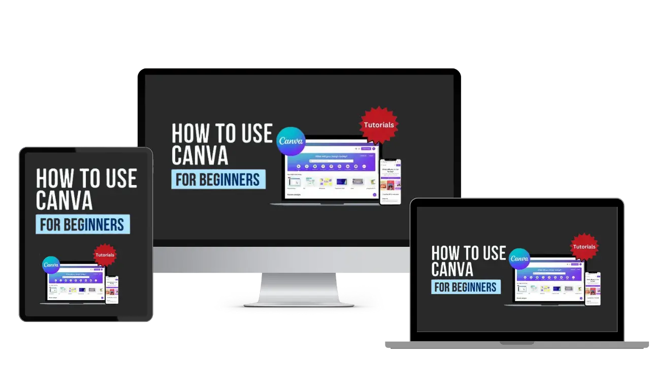
How To Use Canva For Beginners
Master Canva Quickly: Essential Tutorials for Beginners!
Start Creating Stunning Designs with Easy Canva Video Guides!
Step-by-Step Tutorials: From Basics to Brilliant Canva Creations!
Canva Training
What We Offer
CANVA PRODUCTS
Recent Posts


Customers Reviews
Rated 5 out of 5
DFY Niche Websites Testimonial
I bought a premade niche website from DFY Niche Websites. The site I got from them has been a great money maker for me.
I used to work a 9 to 5 job. But since working with Just Dream It Media the owners of DFYNicheWebsites.com I was able to quite my job.
Thanks Chad and Mike!

COLE JOHNSON
Best WordPress Content Creation Plugin!
Over 4,000 Website Using This Powerful WordPress Plugin.
Rated 5 out of 5
WP Learning 101 Testimonial
GREAT COURSE. I understood all of the teaching and it is rare for me to say that due to loss of hearing. The format was laid out in a building format so that each lesson added to the previous information learned. I have been searching for years for this information presented so that I could hear and understand. THANK YOU!! Five star from beginning to end.

Mike Sendler