


How To Use Canva Templates To Create Infographics Tutorial For Beginners
Canva Tutorial
Watch The How To Use Canva Templates To Create Infographics Tutorial For Beginners Video Below

How To Use Canva Templates To Create Infographics
Learn How To Use Canva Templates To Create Infographics
Easy To Follow Canva video Tutorial For Beginners
Here Are Some Of Our Services
How To Use Canva Templates To Create Infographics Tutorial For Beginners

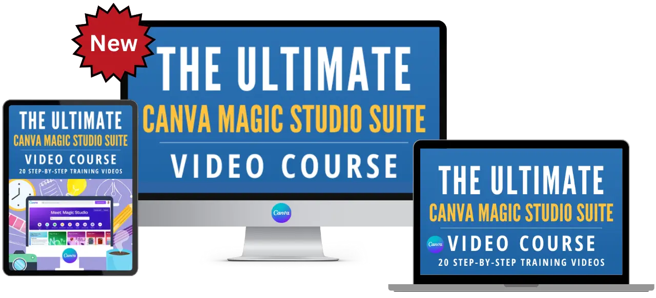
PLR Canva Templates!
Start Creating Stunning Designs with Customizable Templates!
Get Instant Access to These Ready-to-Use PLR Canva Templates Today!

Content Creation Services

Unlock Canva Cash: The Ultimate Guide to Making Money with Canva Templates!
Please Watch The
Video Below
Plus Get 4 Free Canva Mockup Templates & Start Earning Now!
Frequently Asked Questions
Welcome to Our Detailed FAQ Guide on Creating Infographics with Canva Templates
Embarking on the journey of infographic design can be a thrilling and creative process, especially when you have the right tools at your disposal. Our extensive FAQ section is tailored to guide beginners through the exciting world of crafting informative and visually appealing infographics using Canva. Whether you’re a student, a professional, or someone passionate about presenting data in an engaging way, these FAQs are designed to simplify the process and inspire your creativity.
In this section, we delve into various aspects of infographic creation using Canva’s intuitive platform. From choosing the perfect template to customizing it with your data, colors, and graphics, we’ve covered every step in detail. Each FAQ is filled with easy-to-understand explanations, practical tips, and real-life examples that illustrate how to effectively use Canva’s features to bring your data to life.
Our goal is to empower you with the knowledge and skills to transform complex information into stunning, easy-to-digest visual stories. Canva’s user-friendly interface makes it an ideal choice for beginners, and our guide is here to help you navigate it with confidence.
So, whether you’re aiming to make an impact with your next business presentation, share insightful data on social media, or simply explore the art of visual communication, these FAQs are your gateway to mastering the art of infographic creation with Canva. Let’s dive in and unleash the power of visual storytelling!
Answer: Choosing the right template is the first step in creating an engaging infographic in Canva. Canva offers a diverse range of templates, catering to different styles and information types.
Identify the Purpose of Your Infographic: Determine the goal of your infographic. Is it to present data, explain a process, or provide an overview of a topic? Understanding your objective will guide you in selecting the most appropriate template.
Browse Canva’s Infographic Templates: Navigate to Canva’s template library and select ‘Infographic’. Here, you’ll find templates for various needs – from educational infographics to business reports. Look for a design that aligns with your content’s nature and your intended message.
Preview and Select: Hover over templates to get a quick preview. When you find a design that resonates with your needs, click on it to start editing. Remember, the template is just a starting point – you’ll customize it to make it your own.
Real-Life Example: If you’re creating an infographic about the benefits of a healthy diet, choose a template with a clean, organized layout that allows for listing these benefits alongside relevant icons or images.
Answer: Customizing a template is where you infuse your personal touch, making the infographic truly yours. Canva’s user-friendly interface makes this process accessible to beginners.
Edit Text and Fonts: Click on the text in the template to edit. Input your information and adjust the font size, type, and color to match your topic’s tone. Ensure the text is easy to read and understand.
Adjust Design Elements: Change or add new elements like shapes, lines, icons, or images. Canva provides a rich library of elements that you can drag and drop into your infographic. This enhances visual appeal and helps convey your information more effectively.
Modify Color Scheme: A cohesive color scheme is key to a visually appealing infographic. Use your brand colors or select a palette that complements your content. Canva offers pre-set color combinations or allows you to create a custom palette.
Real-Life Example: For an infographic on global warming, use earth tones for your color scheme. Replace generic icons with relevant environmental icons, like trees or the globe, and use charts to visually present data like temperature changes over the years.
Answer: Infographics often include data and charts to convey information effectively. Canva makes it simple to add and customize these elements.
Adding Charts: In Canva, click on the ‘Elements’ tab and choose ‘Charts’. Select the type of chart that fits your data, like a bar, line, or pie chart. Drag it onto your infographic.
Customize Your Chart: Once you’ve added a chart, input your data. You can do this manually or import data from an external source. Customize the chart’s colors and labels to match the rest of your infographic.
Presenting Data Visually: Beyond traditional charts, think about creative ways to present data. Use icons or illustrations as visual representations of data points. This can make your infographic more engaging and easier to understand.
Real-Life Example: In an infographic about internet usage statistics, use a bar chart to represent the data. Customize the chart with internet-related icons, like smartphones or computers, for each bar to make it visually appealing and on-topic.
Answer: Color is a powerful tool in infographics, as it can guide the viewer’s attention and convey the mood or theme of your information.
Choose a Color Scheme: Start by selecting a color scheme that reflects the tone of your content. For corporate or professional infographics, opt for more subdued, professional colors. For more dynamic topics, brighter colors can add energy.
Use Color to Highlight Key Information: Employ color to draw attention to important data points or sections. Contrasting colors can make certain elements stand out and help in segmenting different parts of your infographic.
Consistency is Key: Ensure that your color usage is consistent throughout the infographic. This includes the background, text, graphics, and data visualization elements. Consistency helps in creating a cohesive and professional look.
Real-Life Example: For an infographic on ocean conservation, use shades of blue and green to reflect the aquatic theme. Highlight crucial statistics or messages in a contrasting color, like orange, to make them stand out.
Answer: Text in an infographic conveys crucial information and should be clear and concise. Canva offers various text editing tools to enhance the effectiveness of your message.
Editing Text: Click on any pre-existing text box in your template to start editing. You can change the content, font style, size, and color. For new text, click on the ‘Text’ tab and choose from various text styles.
Hierarchy and Readability: Create a visual hierarchy with your text. Use larger, bolder fonts for headings and smaller fonts for body text. Ensure that the text is easily readable against the background.
Keep it Concise: Since infographics are a visual medium, it’s important to keep text brief and to the point. Use bullet points or short sentences to convey your message effectively.
Real-Life Example: In an infographic about healthy eating habits, use headings for each habit and a concise explanation underneath. Choose a legible font that complements the infographic’s style.
Answer: Icons and images are integral to infographics, helping to visually represent concepts and data.
Selecting Icons and Images: In Canva, go to the ‘Elements’ section and choose from a wide range of icons and images. Select ones that are relevant to your content and match the style of your infographic.
Customization: You can customize the size and color of icons and images to fit your design. Ensure they are sized appropriately in relation to your text and other elements.
Visual Balance: Maintain a balance between icons/images and text. Too many visuals can make your infographic look cluttered, while too few can make it text-heavy and less engaging.
Real-Life Example: For an infographic on renewable energy sources, use icons representing the sun, wind, water, etc., to visually complement the information. Ensure these icons are consistent in style and color for a cohesive look.
Answer: Organizing information effectively in an infographic is crucial for clarity and impact.
Define the Flow: Decide on the direction in which you want the viewers to read the information. Most infographics follow a top-to-bottom or left-to-right flow. Use Canva’s grid lines and alignment tools to organize elements systematically.
Segment Information: Break down your content into sections or blocks. Use different background colors, borders, or dividers to visually separate these sections in your infographic.
Balance Between Text and Graphics: Aim for a harmonious balance between text and visuals. Too much text can overwhelm viewers, while too many graphics might dilute the message. Use white space effectively to avoid clutter.
Real-Life Example: For an infographic on time management, you might divide the content into sections like ‘Importance of Time Management’, ‘Tips’, and ‘Tools’. Use distinct icons and minimal text for each tip to make the sections clear and easy to follow.
Answer: Personal branding in your infographic helps in maintaining consistency and brand recognition.
Incorporate Brand Colors and Fonts: Use your brand’s color scheme and fonts in the infographic. If your brand has specific fonts that are not available in Canva, you can upload them (with a Canva Pro account).
Add Your Logo: Place your logo strategically in the infographic. It should be visible but not overpowering. The footer or the corner of the infographic are commonly used positions.
Consistent Style Across Infographics: If you create infographics regularly, maintain a consistent style. This includes layout, color scheme, font, and the type of visuals you use. Consistency helps in building a recognizable brand style.
Real-Life Example: If you’re creating an infographic for your marketing consultancy firm, use your firm’s colors and fonts. Add your logo in the bottom corner and ensure that the style aligns with your other marketing materials.
Answer: Once your infographic is ready, sharing and distributing it effectively is key to reaching your audience.
Download in the Right Format: Canva allows you to download your infographic in various formats. For web use, PNG or JPEG is suitable. For print, PDF is recommended. Ensure the resolution is high enough for clear viewing.
Sharing on Social Media: Share your infographic directly on social media platforms. Consider the platform’s preferred image dimensions and adjust your infographic’s size accordingly in Canva.
Embed on Websites or Blogs: You can embed the infographic on your website or blog. Download the infographic as an HTML file from Canva and embed it, or use the image file with a link back to the full-size infographic.
Real-Life Example: If you’ve created an infographic about the benefits of meditation, share it on social media platforms like LinkedIn or Instagram, ensuring it’s sized appropriately for each platform. Also, consider embedding it in a relevant blog post on your website.
Answer: Collaborating on an infographic can bring diverse perspectives and ideas. Canva’s collaboration features make it easy to work with others.
Invite Team Members: In your Canva design, click on the ‘Share’ button and invite team members or collaborators by email. You can set permissions to control whether they can view or edit the design.
Real-Time Collaboration: Canva allows multiple users to work on a design simultaneously. You can see changes made by others in real time, which is especially useful for brainstorming and immediate feedback.
Leave Comments: Use the comment feature to give or receive specific feedback on different parts of the infographic. This helps in making precise adjustments and ensures everyone’s input is considered.
Real-Life Example: If you’re working on an infographic for a company report, collaborate with team members from different departments. They can provide accurate data, ensure correct representation, and give feedback on the design’s relevance to their respective areas.
Answer: Creating an accessible infographic means ensuring that it is understandable and usable for people with various abilities, including those with visual impairments.
Use Clear, Legible Fonts: Choose fonts that are easy to read. Avoid overly stylized fonts and ensure sufficient contrast between text and background colors.
Consider Color Blindness: Be mindful of color combinations that are problematic for color-blind viewers. Tools like Canva’s color palette generator can help in choosing accessible color schemes.
Include Alt Text for Images: When sharing your infographic online, especially on websites, include alt text for images. This text description helps screen readers convey the information to visually impaired users.
Real-Life Example: For an educational infographic, choose high-contrast colors and simple fonts. Provide descriptive alt text for complex graphics or charts to ensure the information is accessible to viewers using screen readers.
Answer: A well-designed infographic strikes a balance between text and imagery, ensuring neither overwhelms the other.
Complementary Imagery: Choose images and icons that complement the text, not just visually, but in terms of content as well. Each visual element should add value or context to the accompanying text.
Proportionate Text and Imagery: Avoid crowding the design with too much text or too many images. Use white space effectively to create a clean, organized look that is easy on the eyes.
Hierarchical Layout: Create a visual hierarchy where key information stands out. Use larger or bolder fonts for headlines and smaller fonts for detailed text. Align images and text in a way that guides the viewer’s eye through the infographic logically.
Real-Life Example: In an infographic about renewable energy, use relevant icons next to statistics about different energy sources. Arrange these elements in a way that leads the viewer naturally from one point to the next, using text to explain and images to illustrate.
Answer: Selecting the appropriate chart type is crucial for effectively conveying data in your infographic.
Identify the Nature of Your Data: Different chart types are suitable for different data sets. For example, use bar charts for comparisons, line charts for trends over time, and pie charts for showing proportions.
Customize Your Chart in Canva: After selecting the right chart type in Canva, customize it to fit your infographic’s theme. Adjust colors, labels, and fonts to ensure it aligns with the overall design.
Simplify for Clarity: Avoid overcomplicating your chart with too much information. Focus on key data points to make your chart easy to understand at a glance.
Real-Life Example: If creating an infographic on social media usage statistics, a bar chart could effectively compare the number of users across different platforms. Customize the chart with colors that match your infographic’s scheme and ensure the data is easy to read.
Answer: Layering can help manage multiple elements in a complex infographic, ensuring a clean and organized design.
Understand Layering: In Canva, each element you add to your design is on a separate layer. You can bring elements forward or send them back to create a sense of depth or highlight certain aspects.
Organize Your Elements: Use layering to organize elements in your infographic. Background elements should be on lower layers, while key information or data visualizations should be more prominent.
Maintain Readability and Clarity: Ensure that layering does not compromise the readability of your text or the clarity of your visuals. Text should always be on top of images or busy backgrounds.
Real-Life Example: For an infographic about environmental conservation, you might have a background layer with a nature-themed image, a middle layer with semi-transparent color blocks for text, and a top layer with clear, bold text and icons.
Answer: While Canva doesn’t natively support complex interactive elements in infographics, there are ways to create a pseudo-interactive experience.
Create Visual Interest: Use Canva’s animation features to add simple animations to your infographic. This can make your design more dynamic and engaging.
Link to Additional Resources: If sharing your infographic digitally, you can add hyperlinks to text or images, directing viewers to more in-depth resources online.
Encourage Viewer Participation: Design your infographic to encourage viewer interaction, such as prompting them to follow a social media account or participate in a survey.
Real-Life Example: In an infographic about healthy lifestyle tips, include animated icons that highlight each tip. Add a QR code or a short link directing viewers to a detailed blog post or video for more information.
Answer: Maintaining a consistent style is key to creating a professional and cohesive infographic.
Set a Style Guide: Decide on specific fonts, color palettes, and types of visuals (like icons or illustrations) before you start designing. Stick to these choices throughout your infographic.
Use Canva’s Brand Kit: Canva Pro users can utilize the Brand Kit to store and apply consistent brand colors, fonts, and logos. This tool ensures that every element of your infographic aligns with your chosen style.
Regularly Review for Consistency: As you design, periodically step back and review your infographic as a whole. Ensure that each element conforms to your style guide, adjusting any discrepancies as you go.
Real-Life Example: If you’re designing an infographic for a health and wellness blog, establish a calming color scheme, select two or three easy-to-read fonts, and use consistent health-themed icons. Regularly check to make sure these elements are consistently applied.
Answer: A well-balanced layout is crucial for an attractive and effective infographic. Canva’s grids and alignment tools can help achieve this balance.
Utilize Grids for Placement: Canva’s grid tool can help you place elements evenly throughout your design. This is especially useful for aligning text boxes, images, and other components in a visually pleasing manner.
Alignment for Cohesion: Use Canva’s alignment tools to ensure your text, images, and shapes are aligned either to each other or to your overall design. This creates a tidy, professional look.
Symmetry and Spacing: Be mindful of symmetry and spacing. Balanced white space can make your infographic appear more organized and less cluttered.
Real-Life Example: In an infographic about global climate change, use grids to evenly distribute sections for different climate factors. Align text and visuals within each section for a neat, organized appearance.
Answer: Optimizing your infographic for various platforms ensures it looks great and functions well, no matter where it’s viewed.
Understand Platform Requirements: Different platforms may have different size and format requirements. For instance, an infographic for Instagram might need to be more vertical, while one for a blog can be wider.
Resize and Adapt Your Design: Use Canva’s resizing tool to adapt your infographic to the platform you’re targeting. You might need to tweak the layout slightly to ensure it remains effective in different sizes.
Quality and Load Time: Ensure your infographic maintains high quality when resized. Also, consider the load time – larger file sizes might take longer to load on web pages.
Real-Life Example: If you’re sharing your infographic on both Instagram and a company blog, create two versions. The Instagram version should be more concise and vertical, while the blog version can be more detailed and horizontal.
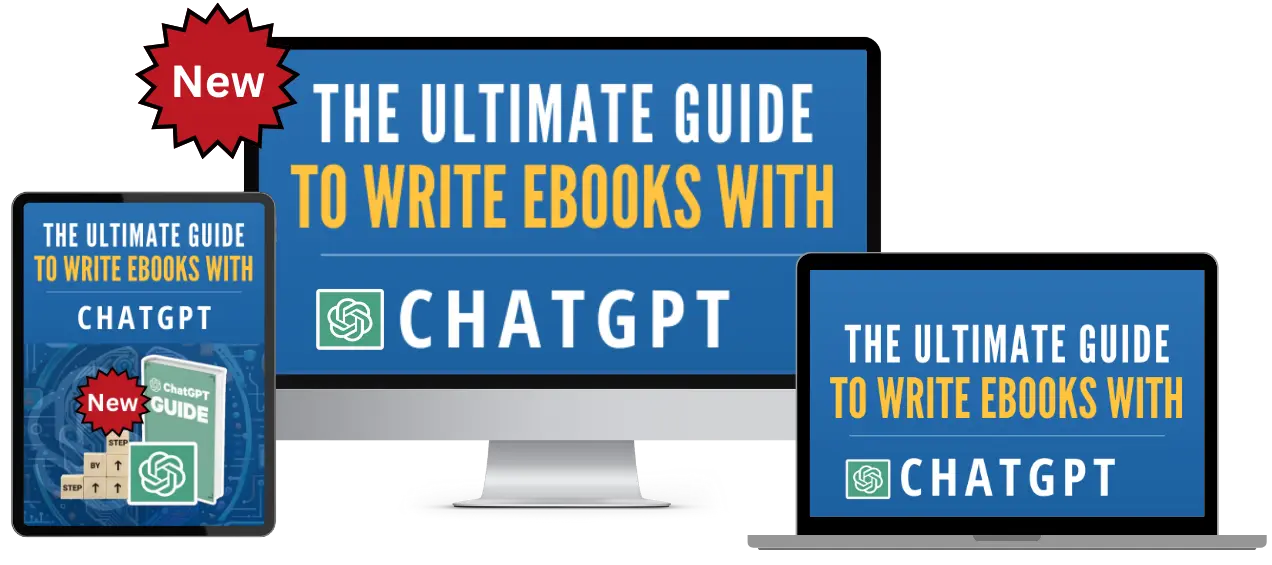
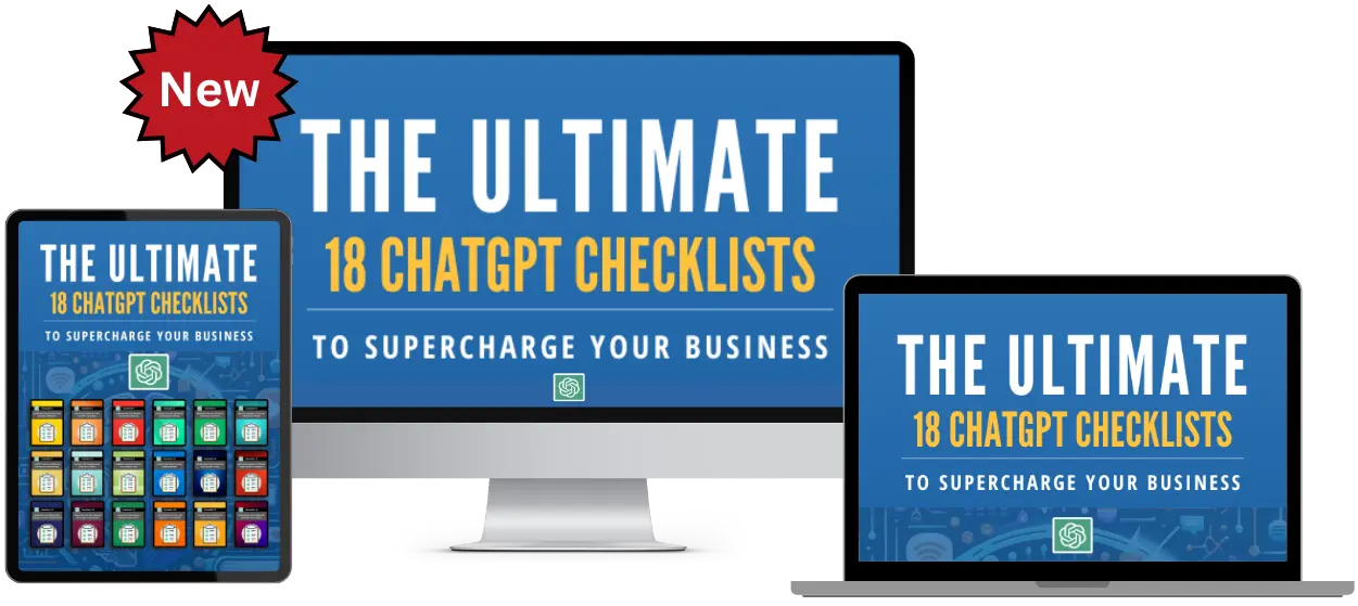
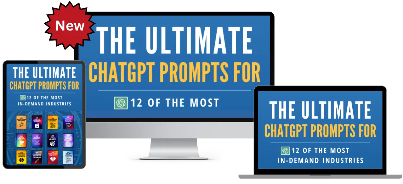
ChatGPT Prompts
ChatGPT Training
What We Offer
CHATGPT PRODUCTS
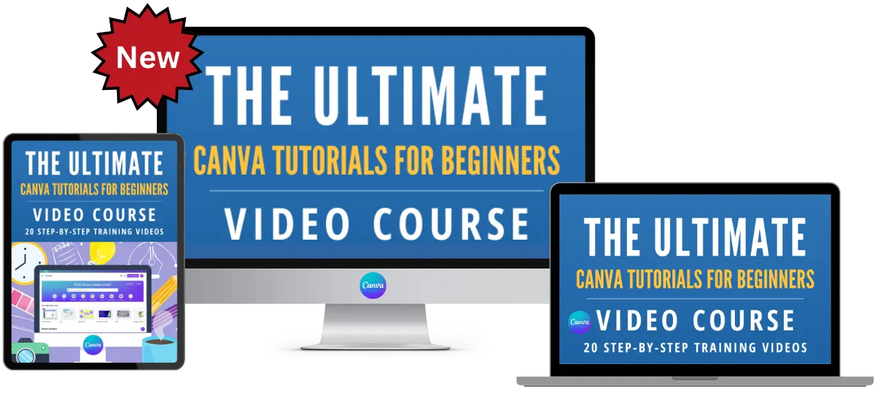
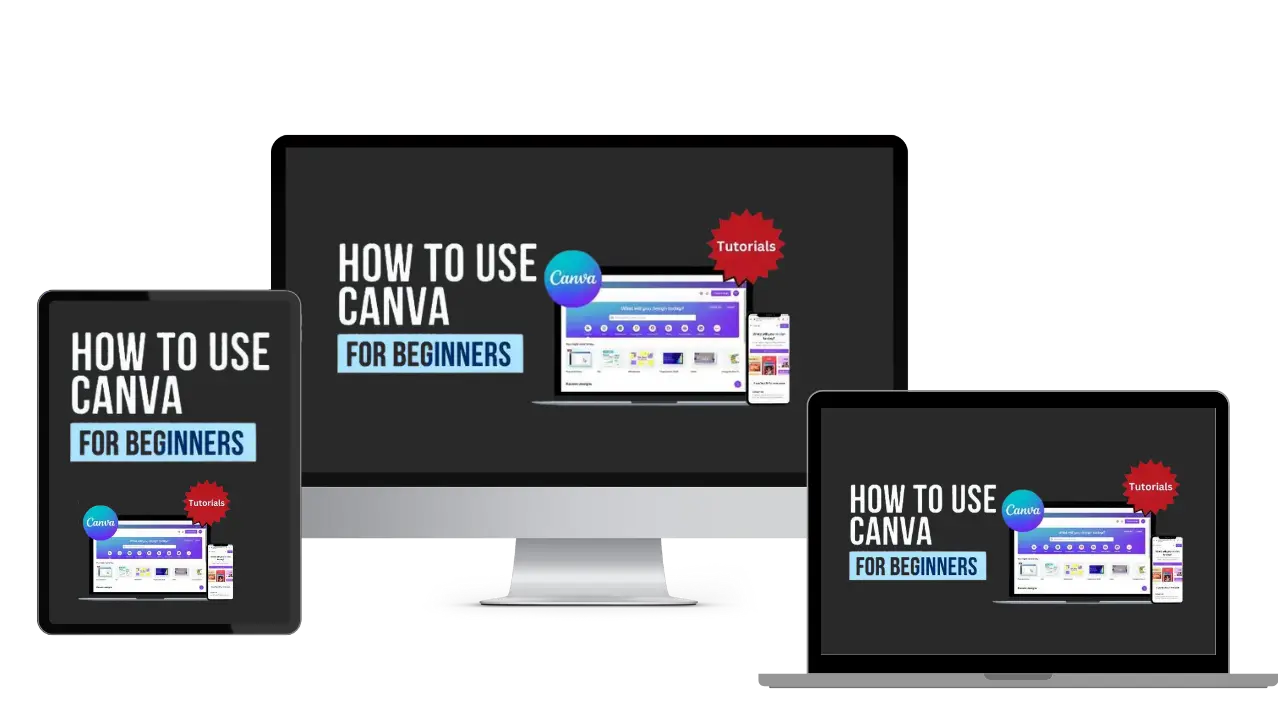
How To Use Canva For Beginners
Master Canva Quickly: Essential Tutorials for Beginners!
Start Creating Stunning Designs with Easy Canva Video Guides!
Step-by-Step Tutorials: From Basics to Brilliant Canva Creations!
Canva Training
What We Offer
CANVA PRODUCTS
Recent Posts


Customers Reviews
Rated 5 out of 5
DFY Niche Websites Testimonial
I bought a premade niche website from DFY Niche Websites. The site I got from them has been a great money maker for me.
I used to work a 9 to 5 job. But since working with Just Dream It Media the owners of DFYNicheWebsites.com I was able to quite my job.
Thanks Chad and Mike!

COLE JOHNSON
Best WordPress Content Creation Plugin!
Over 4,000 Website Using This Powerful WordPress Plugin.
Rated 5 out of 5
WP Learning 101 Testimonial
GREAT COURSE. I understood all of the teaching and it is rare for me to say that due to loss of hearing. The format was laid out in a building format so that each lesson added to the previous information learned. I have been searching for years for this information presented so that I could hear and understand. THANK YOU!! Five star from beginning to end.

Mike Sendler